How Branding Can Elevate Your Real Estate Agency: The Franklin Story
Franklin Branding
Franklin Real Estate is an up-and-coming realty firm focused on real estate. We have collaborated on their new visual identity.
Branding

About The Client
Franklin Nekretnine or Franklin Real estate is an emerging, full-service real estate agency. Kristijan, the founder of Franklin nekretnine d.o.o. came from years of experience in real estate affairs and decided to implement his business model & philosophy into his own company.
The name of the agency was one of the first things he had to decide on. After extensive research on names, meanings, and motifs, we agreed on the name Franklin. The term “Franklin” dates from the 14th and 15th centuries, and it represented a landowner of free but not noble birth.
Franklin Real Estate agency offers a particular philosophy with that simple name: With us, you don’t have to be a nobleman to own real estate!
Main Tasks
As a company emerging on the market, Frankin Nekretnine was in the primal need for essential branding elements for starting a business. Our main task was to create a complete brand book with all associated features and some business cards and logos.
The Challenge
The challenge was to incorporate desired colors with some other base elements:
- The letter F (for Franklin)
- The letter N (for Nekretnine – meaning real estate)
- The square details
- A house representing the land with a real estate
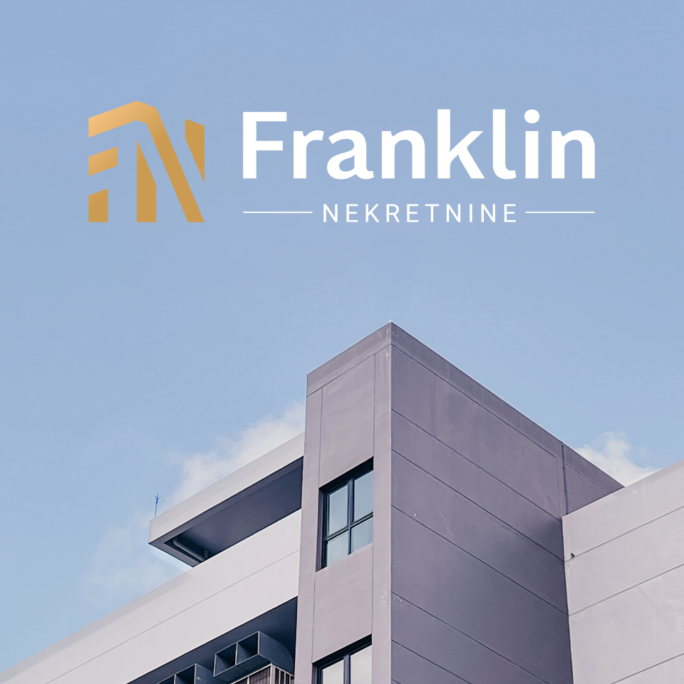
All of that resulted in a logo you see below.
The other challenge was to display Franklin Nekretnine as a full-service real estate agency. The task of graphic design elements was to create trust with potential future clients and customers. They are to leave an impression of excellent customer care and a professional approach to all clients’ needs. The entire branding had to be luxurious and professional yet approachable and straightforward.
What We Did
The branding reflects three main characteristics of Franklin Nekretnine: full-service agency, professional approach, and care for its clients throughout acquiring real estate.
In the Middle ages, Franklin was a social rank for free people who owned land but were not noble blood, as we mentioned above. One of the biggest challenges was depicting Franklin’s name and assigning all the key concepts to communicate with relative simplicity and make it approachable to its target audience.
A simple solution we found was to take a symbol, a piece of bounded land, and to depict it with a square. That choice provided the flexibility to form different shapes where each one would represent a different idea that this brand should communicate. After a few iterations, we choose the final design. From the simple square, we formed a cube, a house, and combined it with the initials F and N. By using colors such as navy and gold, the branding shows its luxurious nature and notes the professionalism it should represent.
Along with standard materials such as business cards and brand guidelines, we also created a unique key visual used for secondary branding (for example, on social media). The key’s bow consists of a logotype inside a white circle. The key cuts depict some of the most recognizable Zagreb buildings’ silhouettes to indicate the agency’s location. The final element of the key visual is the company slogan in Croatian, which would translate to: “The key to your new home.”
After all, what better to have as a key visual than an actual key?


