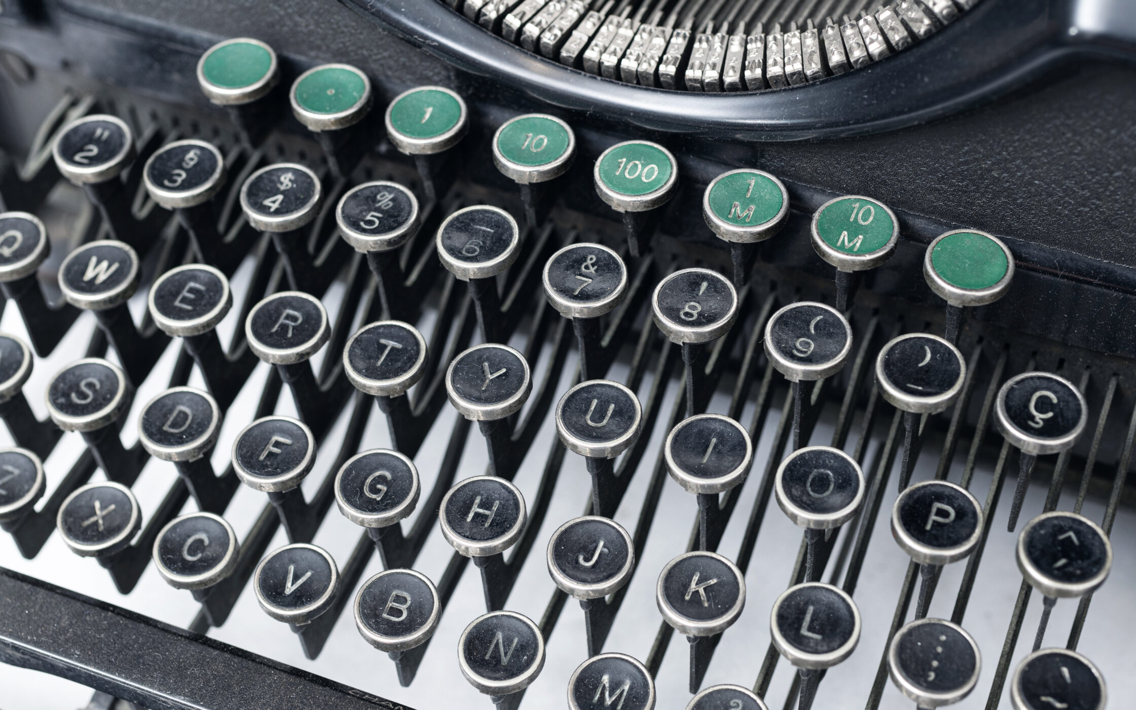
Why is typography so important?
You are writing an article or a piece of text that’s going to be seen somewhere? The first thing you (should) ask yourself is: which font am I going to use? If you plan on using more than one font, you should know some basic things about choosing and matching more fonts.
There is no right or wrong way to choose or match more than one font for a written piece. Still, like the basic typographic rules mentioned in our Typography 101 article, there are some standards that generally result in visually attractive and readable letter formations. Like most general guidelines, these may not always apply to your project, but nine out of ten times they will at least help you eliminate the least functional combination as well as some critical errors.
Before I spring some heavy typography knowledge on you, I’ll introduce some basic typographic terms such as typeface and type classification. After reading this you will understand how seemingly small changes in type design can greatly affect the look and feel of whatever it is you are writing.
Typeface vs. Font
If you have ever read anything about typography, you probably came across both of these terms and might wonder what the difference is. Well, a typeface is a set of typographical symbols and characters that share common design features. It includes letters, numbers and any special characters which we use to put together words and sentences on paper and screen.
Generally, we defined font as a complete character set within a typeface. It comes in a specific size and style. For example, Roboto Thin Italic is a different font from Roboto Black Italic, but both fonts are within the same typeface – Roboto. And Roboto is a different typeface from Gotham or Times New Roman.
So when people talk about fonts, what they are talking about are typefaces or type families (groups of typefaces with similar or related design).
Classifying Type
This is a pretty wide topic and it keeps expanding with all the new fonts and typefaces that are emerging these days, so I’ll stick to the basic classification such as serif, sans-serif, script, display, and others. Typefaces can also be classified based on their technical specifications, such as proportional vs. monospaced, or even by the mood they bring into the visual component.
#1 Serif
A small extra stroke found at the end of the main vertical and horizontal strokes of some letters is called a serif. Serif typefaces are mostly used for body text in books, newspapers, and magazines because they are easy to read and pleasant to the eye. Serif fonts are not as useful for web designs, particularly when they are used in small sizes. Because the screen resolution of some computer monitors is low, the tiny serifs can be lost or fuzzy, which makes the text difficult to read. Many web designers prefer using sans-serif fonts for a clean and modern, casual vibe.
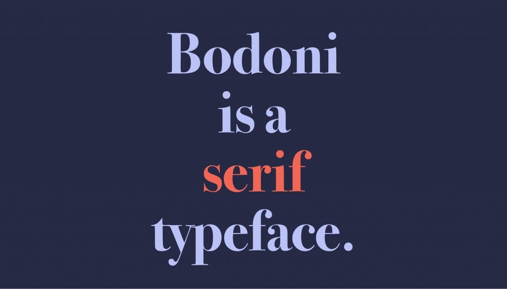
There are many sub-types within the serif classification. In each classification (except informal or novelty fonts) fonts share similar characteristics including the shape or appearance of their serifs. They can be loosely categorized as follows:
Modern
Modern serif fonts date to the late 18th century. Improvements in paper quality combined with more advanced printing methods brought about changes in how typefaces were created. Modern fonts are recognizable by their thin, long horizontal serifs, and clear-cut thick/thin transitions in the strokes. The stress is vertical, i.e. there is no slant on the letters.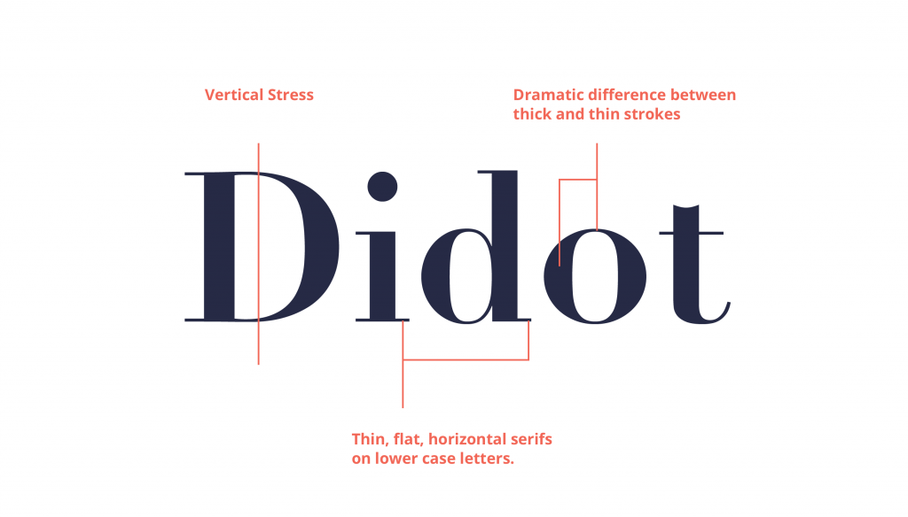
They are not suitable for large amounts of body text, either on the web or in print. But they can look really eye-catching and very elegant at large sizes. You probably have a number of Modern fonts on your computer already. Some examples are Bodoni, Didot, Onyx, Times Bold, Bernhard Modern, Walbaum and Century Schoolbook.
Old style
Old style typefaces are based on the hand lettering of scribes and they first appeared in the late 15th century, before Modern typefaces. Their relation to calligraphy can be seen in the curved strokes and letters with thick to thin transitions, looking somewhat like letters drawn with a pen and ink. Unlike Modern typefaces, the thick/thin transition is moderate and not so obvious. The serifs on Old Styles are always angled and if you draw a line through the thinnest parts of the letters, you’ll see that the stress is diagonal. They are generally sharp in appearance.
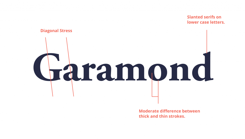
The very first italic letters were produced with Old Style fonts in the early 1500s. Old Style typefaces are considered to be the best type for large amounts of the body text on paper. That’s why you’ll find them used heavily in newspapers, magazines, and books. They can also work well on the web and font what is considered to be web-safe is Palatino Linotype. Old Styles don’t jump off the page with any sort of quirkiness and that’s what makes them easy on the eye. Some of the popular typefaces from this category include Garamond, Adobe Jenson, Goudy Old Style, Palatino, Bembo, and Galliard.
Transitional
Transitional typefaces are typefaces that are in transition from the old style to modern. They come after grade typefaces such as Garamond and Caslon and before the moderns such as Didot and Bodoni. Transitional serifs or baroque dates back to the 1700s when improved printing methods made it possible to reproduce fine line strokes. The contrast between thick and thin strokes of characters is more noticeable. Traditional serifs also come with heavily bracketed serifs. In the image below we placed typefaces from the Old style, Transitional and Modern classes next to each other so you can get a picture of why this class is called ‘transitional’. As you can see the letterforms change from calligraphic to increasingly mechanical.

Some of the popular typefaces from this category are Times New Roman, Baskerville, Fleischman, Charter, and Miller. Transitional serifs are the most common serif typefaces.
Now you can see how these classifications were formed. Claude Garamond did not consider himself a designer of Old style typefaces, nor did Baskerville consider himself a designer of Transitional typefaces. By studying these typefaces, designers were able to notice the changes in style that evolved during time, and scholars came to categorize Garamond as Old Style and Bodoni as a Modern typeface. Baskerville was, and still is, considered the bridge between these styles so it became known as a Transitional typeface.
#2 Slab serif
After Bodoni, type design went crazy. Typographers were in constant search for new forms and ways of expression, so all kinds of bold, extended, condensed and decorative typefaces were created. One of the styles that emerged was Egyptian, also called slab serif or square serif. Slab serifs contain little to none contrast between thin and thick strokes. Serif terminals may be either blunt and angular (Rockwell), or rounded (Courier). Slab serifs were invented in and most popular during the nineteenth century. There are several main subgroups of slab serif typefaces such as the Antique model, Clarendon model, Italienne model, Typewriter typefaces and Geometric model. In the example, below are some most popular slab serif fonts. 
#3 Sans Serif
Before the twentieth century, sans serif typefaces were rarely used and usually limited to display use. Somewhere in the mid-twentieth century, they became insanely popular because of their refined and modern design. Still, they were considered inappropriate for general text usage. Today they are commonly used for print as well as for display. Helvetica is the most widely used of all sans serif typefaces, and the Helvetica family is probably the most diverse of all types of families.
Sans serif typefaces can be classified into 4 basic and most common groups: Grotesque, Neo-grotesque, humanist and Geometric.
Grotesque
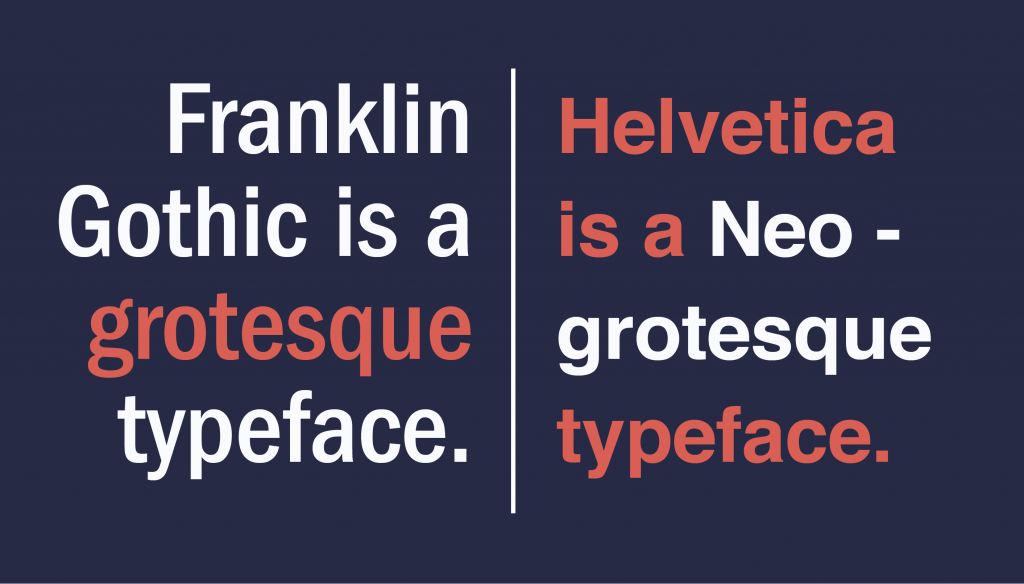
Grotesque is a group of sans serif typefaces from the 1800s to the early 1900s. A lot of these typefaces exist only in capitals or in extremely old specimen books. Still, some of them are commonly used (Franklin Gothic). These typefaces are characterized by very awkward character weight distribution and irregular curves. Some of the most used typefaces from this group are Franklin Gothic, Monotype Grotesque and Schelter Grotesk.
Neo-Grotesque
Just as the name implies, Neo-Grotesque is a group of typefaces with a modern design based on grotesque types. It is also called Transitional (in terms of sans-serif classification) or Realist and includes some of the most commonly used sans. They are based on the late Grotesques with more careful construction and a new feel for aesthetics. It is a group of neutral and simple typefaces which was popular among the Modernists and still is today. The group differs from Grotesque with the loss of awkward curves and wide varieties in weight distribution. Popular typefaces from this group are Helvetica, Highway Gothic, Bell Centennial, Arial, and MS Sans Serif.
Humanist
Humanist typefaces are the most calligraphic of the sans-serif typefaces. They are characterized by some variation in line width and the fact that they are more legible than other sans-serif fonts. The Humanist sans group includes typestyles like Gill Sans, Myriad, Trebuchet, Tahoma, Verdana, and Calibri.
Geometric
Geometric typestyles are, just as their name suggests, geometric shapes combined to create characters. They can be recognized by the optically circular letter “O” and are otherwise very rectangular. The first typeface ever to be recognized as Geometric sans was designed by Jakob Erbar. Erbar-Grotesk was released in the 1920s with the intention of being very legible but became known as the pioneer of the least legible typeface group. This group includes typestyles like Kabel, Nobel, ITC Avant Garde, Century Gothic, Gotham, and Futura.

There are a lot more classifications like Decorative, Stencil, Script, Freestyle, Blackletter, and others, but we have covered the main ones.
Superfamily
So now that we’ve got that covered we can implement our newly found knowledge to create great examples of mixing typefaces. As you have seen so far, typography knows no borders, and creating great typefaces as well as typeface combinations is a matter or art. If you apply all the basic rules, you will most likely end up with a suitable combination for your project. If you add a little crazy and out-of-the-box design, you just might end up with something great!
There is a lot of tips and techniques that help you end up with a good typographic result. Some of them say that all you need to do is pair a Serif with a Sans Serif, some that you need to achieve contrast no matter which classification you use, while others will tell you to combine font moods, etc. We will lead you through what we believe are successful tips for mixing typefaces (not that other ones are less successful, it’s just that we’ve implemented these enough times to know they really do give good results).
Earlier we mentioned font families. Now we will mention something called superfamily. In typography, a superfamily is, in fact, a font family that contains different fonts from various classifications. Fonts belonging to a superfamily often belong to different classes like serif and sans but are similar in appearance. Some of the popular superfamilies are:
- FF Quadraat
- FF Scala
- Computer Modern
- Generis
- ITC Humana
- FF Nexus
- Lucida
- Linotype Authentic…
So what we’re trying to say here is that if you go with two to three typefaces from one superfamily (try to avoid combining more than three different typefaces on a single page), they will most likely work in harmony with others and can stand out as well, if needed.
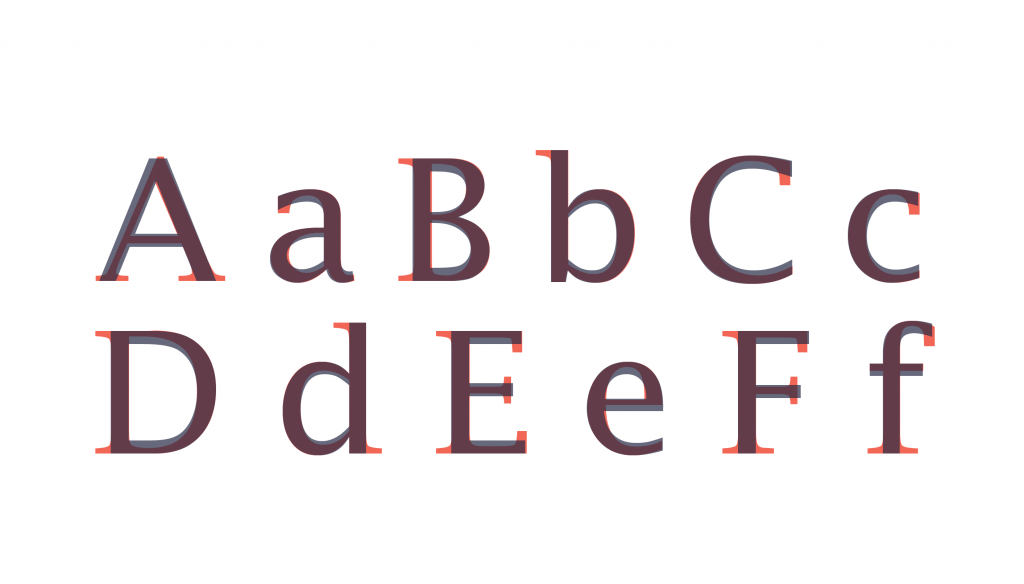
Superfamily typography: 3 methods
Here is a picture of Lucida Sans Regular (in red) and Lucida Bright Regular (in grey). You can see the obvious difference since one is a sans serif and the other a serif typeface, but you can also see the similarities that put these two in the same family.
Another method for mixing typefaces is choosing those with similar visual characteristics and physical attributes. Similar typefaces create a constant mood for your copy and can transfer a message to the readers even before they start reading the text. When going for this method, you need to keep in mind not to choose too similar typefaces; you want your readers to notice the change in the typeface, not to think that you accidentally put a different letter ‘g’, for example, in the middle of a paragraph.
With too many similar characteristics, readers won’t be able to tell the typefaces apart, and they will focus on the small change in details instead of on the content itself. To achieve the balance with similar typefaces, it’s best to choose two that have some common features, such as the fact they both belong to the same class and have similar x-height. Or they don’t belong to the same class but come from the same time period and have the same contrast between thick and thin strokes. The goal here is to try and find some visual characteristics that will bond the two typefaces just enough for them to make your text look like a whole, and yet not as much so that readers can notice the change in type while they read.
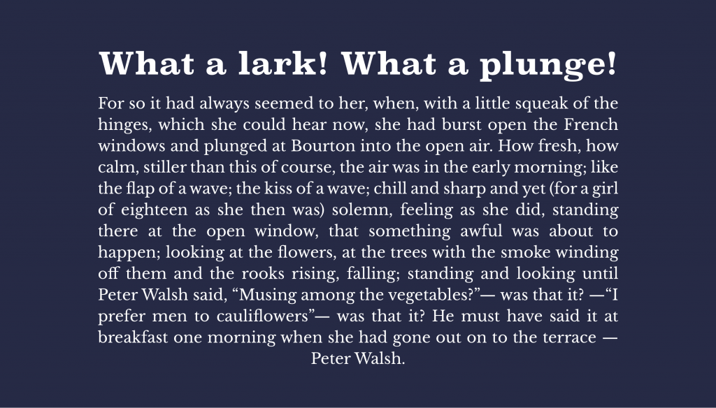
In this example, we paired Clarendon Bold (headline) with New Baskerville (body), and the combination looks very neutral. New Baskerville is a transitional serif typeface and goes nicely with the heavy Clarendon. Although both are serif typefaces, the difference is obvious but not as much to make them look too distinct.
And the third method is going all the way, which is using typefaces that don’t have anything in common. Emphasizing the contrast between your types can create a powerful visual component of hierarchy (mentioned in the previous post), and also unity. The big bold headline can be that one thing that catches the reader’s eye. the thing that gives a personality to your text, or you could always go with a subtle headline and then pair it with a playful typeface like Souvenir.
Souvenir is playful, casual and very pretty! It works well with a typeface that doesn’t have a strong mood, like Futura. It’s pretty simple, it can adapt to many combinations and would look very well when paired with Souvenir. To achieve contrast, we can use type size or typestyle. You don’t necessarily need to use two different typefaces. You can simply make your header a bit bigger, bolder and let’s say in italic style, and you already have contrast and attention.

Conclusion
So to conclude all this, there are a lot of techniques and guidelines on how to mix typefaces. But, overall, it’s all about the context and your imagination. Like we said before, there are no strict rules to follow, just a few simple principles. These principles can make your typographic choices much easier. Also, they help you achieve anything from a solid to extremely good looking typographic result.
In this blog post, we went through the basics of typography, and it’s time to apply those principles to our design. Find out 8 basic rules for good graphic design in our blog post here.


