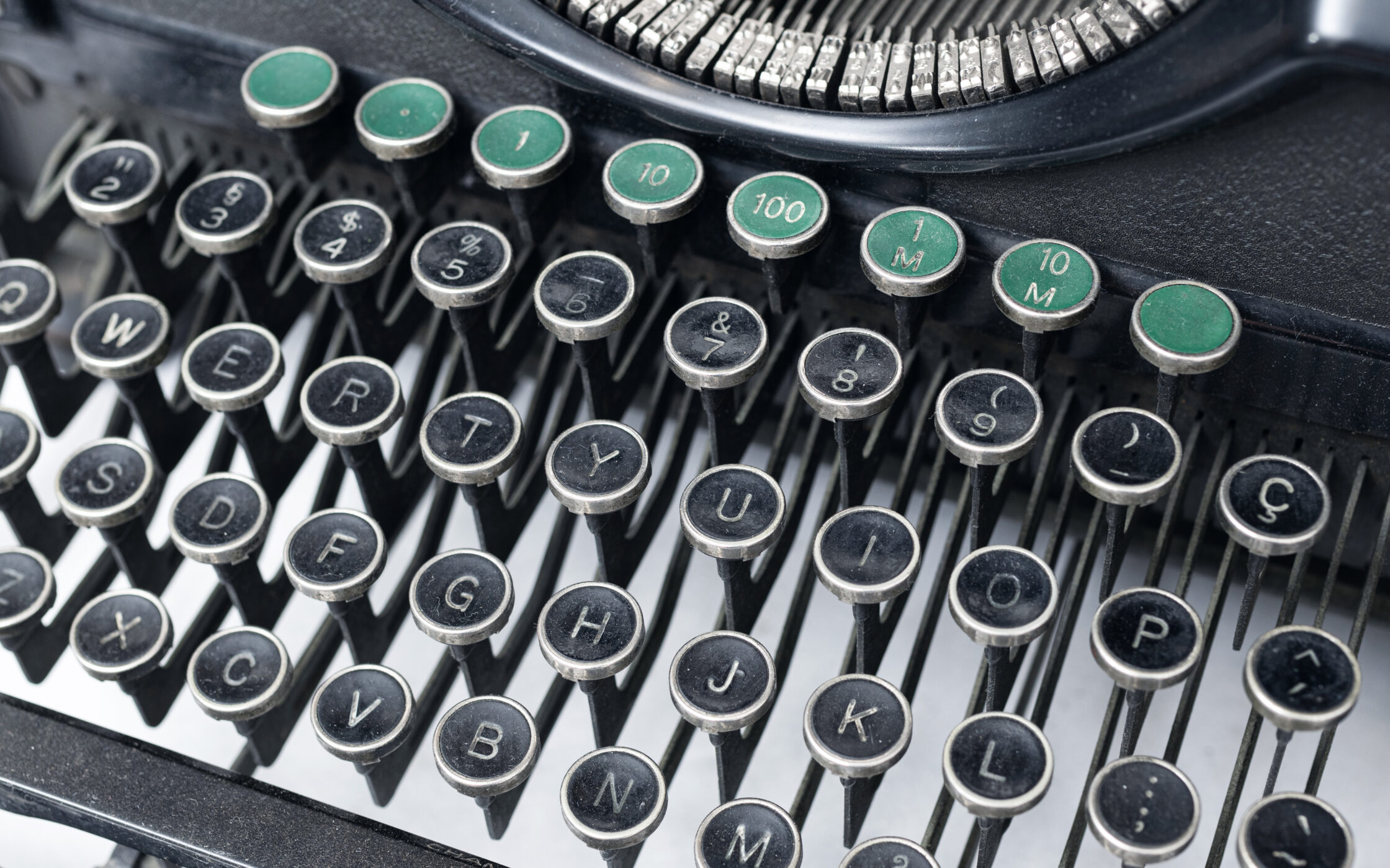
Why does typography matter?
Typography is one of the essential elements of design. In web design, it is no different. First of all, I would like to clarify all the vague terms we usually use interchangeably with the typography. In the past, letters were cast on metal, and each size with its unique weight was called a font. Different fonts were grouped in what was called a typeface. In digital type, terms like font and typeface are almost synonyms, and they usually describe the whole typeface.
On the other hand, typography is the art, or rather, a discipline of arranging and designing a written language to make it legible, readable, and visually appealing. This is why typography matters in general design, but let’s focus on web design for now. If you want to find out a little bit more about typography in general, make sure you read our introduction to typography.
So what is so different between typography in print and its web counterpart? First of all, the medium is entirely different. While printed materials always have fixed dimensions and are static, the web is a highly dynamic and fluid medium with a wide variety of different sizes, resolutions, and other technological limitations and conditions. In print, there’s external lighting, while digital displays rely on the internal backlight, which is different from screen to screen. Printed materials use ink dots to create a picture, while web screens are made of pixels. The differences go on and on. Most importantly, web typography should be flexible and readable on various screen sizes and resolutions. In this article, we will go through the four most important values of web typography:
Typography delivers the message
In face-to-face communication, feedback is instant, and the experience is interactive, making it the most advanced and effective method of communication. There’s no two-way feedback with text, and we’re left only with symbols and letters – a visual representation of language. In this simple way of communication, typography and content need to work together to form our impressions and emotion. By manipulating different properties in typography, we can affect how it delivers a given message.
The elegant type is always a compromise between form and function. The good form improves visual impression and aesthetic quality. Heading and other shorter texts whose goal is to make a statement should rely on the beautiful form. Function comes in handy for smaller type sizes used for running text whose goal is to be read. The most crucial role of headings and display type is to grab the reader’s or user’s attention to the content. When users or readers dig in the content, the role of type is to be legible, readable, and overall functional. By respecting this delicate relationship between form and function, we can communicate and deliver the wanted message in the way we desire.
We should think of a text as a complex and dynamic shape that creates tension and contrasts with the surrounding elements and background. Depending on how we want to present information, we can decrease or increase contrast to control its final tone of voice. Creating contrast helps us build a hierarchy between different typographic elements, which lets us control the message we deliver to the end-user. We can manipulate four different type properties to create contrast – size, colour, shape, and placement of typographic elements. 
It enriches the content
The presentation itself can be a deciding factor in how we interpret the content. The message becomes more interesting if shown appropriately. Like in the real world, many different factors can influence how we interpret certain information. For example, in a world of typography and design, we can manipulate the type’s dimensions, weight, width, height, and other properties.
In that matter, some typefaces are more formal, while some are playful and almost childlike. More organic shapes usually make non-formal fonts, and straight lines with delicately made curves make elegant formal ones.
Imagine for a moment you have to show dull statistics or numbers interestingly, and you choose a playful font usually found on happy birthday cards. Even though this approach may obscure the data or the message you want to deliver, it would be entertaining visually. The truth lies somewhere in the middle, and choosing between the proper form and function is essential for good design. 
Building visual consistency
All information respects some level of the hierarchy. For example, when communicating with someone in person, we can accentuate words or phrases or note what’s important and what’s not. Unfortunately, we don’t have that luxury in the written word, so we must use different rules to get the same effect. In design, we establish a hierarchy by using different sizes, colours, placement, and types.
By consistently applying the same rules for typography on a website, we connect different pages into a single unit, thus creating unity. This is a beneficial method for creating brand consistency for a vast range of devices and screen sizes. 
Brand recognition
We tend to remember typography more than complicated symbols, which is why you probably can’t easily forget Coca Cola’s logo. This is a two-edged sword because people will always judge your product based on the font you choose. Allegedly no one likes comic sans, and too many non-designers use that particular typeface in presentations and other media. It is an example of how one font choice can shape the image of a product and influence our opinion.  The mechanism is the same with well-chosen fonts, but the emotions and views we create are somewhat optimistic. Based on the typography we are using, people will associate certain feelings with our product, which can help us build recognition and enforce loyalty to our brand.


