This is a new series of blog posts where we will be talking about upgrades and redesign process of our website. This is not a complete redesign of Kontra’s website – it’s more like upgrading the existing one to improve the overall design and, of course, to improve the features, reorganize the information structure and to make it more interesting for the visitors. We didn’t change the color shame, typography or the branding elements so that later, we can do the redesign page by page, and it wouldn’t feel like completely another website.
In this blog post, we are going through the process of the work page redesign which was really important to us in many ways. This is one of the most visited pages on our site so it had to be representable.
Our process and goals
Our page redesign process was done in a way to ensure that we’re creating an eye-pleasing design, but it also had to perform on the highest level. By that, we mean that it has to be responsive, mobile-friendly, light, optimized for every browser and speed tested.
Designing
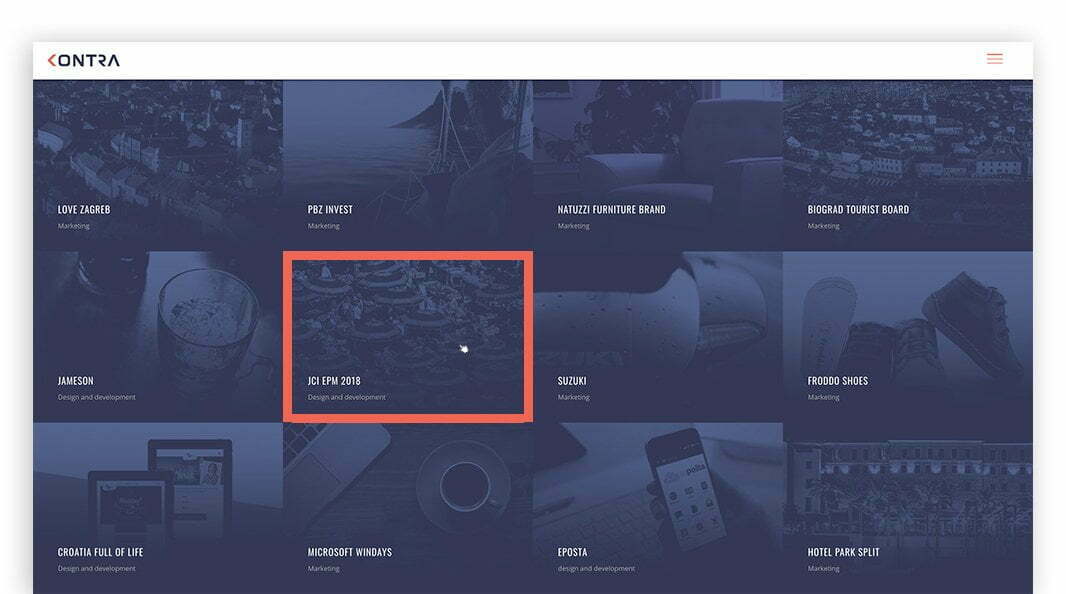
Because this was the first page we were redesigning, we wanted to be sure that it would be done by modern design standards: that’s why we were focused on the grid type design. The grid allows us to divide work cases in blocs. In every row, we have four blocks which represent a different case study.
This kind of block design is also very helpful when we are talking about responsive web design. In our case, we have four blocks in one row, in the best scenario. However, when we are browsing the page on smaller devices with lower screen resolution (e.g. small laptops, tablets, smartphones…), the four-block rows easily turn into three-block rows to keep it from being too crowded. This method of responsive web design is really clear, functional and easy to develop. If it’s done right, there is no worry of a crashed page on some devices.
Each block contains only crucial information which are: the name of the project, services group (marketing, design, development, etc.) and the main image. The goal was that the main images of all case studies need to look cohesive together in one place. We achieved that with producing a Photoshop filter. Every image was filtered with Kontra’s blue color, so now, even though different cases are mixed together, they still appear like the same group.

In the next step, we wanted to create a cool hover effect because it’s important to us that the wanted case is standing out from similar images around it. Also, we wanted to create some new style of animation which we could later apply through the whole website. The solution was to make a solid stroke frame which is divided into two lines. These two lines are starting to travel from down left corner and, very soon, they meet each other in the upper left corner. At the same time, the hover image is starting to zoom in which increases the overall effect. After removing the mouse pointer from the image, everything goes back to where it started.
Conclusion
With this page, we made some new standards which will be applied on other pages throughout our website. This was just a short presentation of the process behind just one website page design. If you have any questions about this, contact us.


