A Brand Shaped by the Adriatic Wind
Estrales Naming & Visual Identity Case Study
The project began with a clear ambition: to create a distinctive premium brand for private boat tours, personalized transfers, and tailor-made Adriatic experiences. Starting with the name and brand direction, we developed a refined visual identity built on ease, trust, and a quieter approach to luxury.
Brand Strategy
Naming
Art Direction
Visual Identity Design
Brand Guidelines
About Estrales
Estrales offers luxury private boat tours, personalized transfers and tailor-made journeys along the Adriatic coast. Rather than offering a single fixed experience, each journey can be shaped around the guest, whether that means a private day at sea, a transfer between destinations, or a fully customized itinerary.
The brand primarily speaks to international travelers seeking privacy, quality, safety, and personalized service, while also positioning itself as a reliable premium partner for travel agencies and tour operators. The focus is not simply on getting from one place to another, but on creating an Adriatic experience that feels effortless, considered, and personal.
Starting with the Name
The name came first, and it shaped everything that followed.
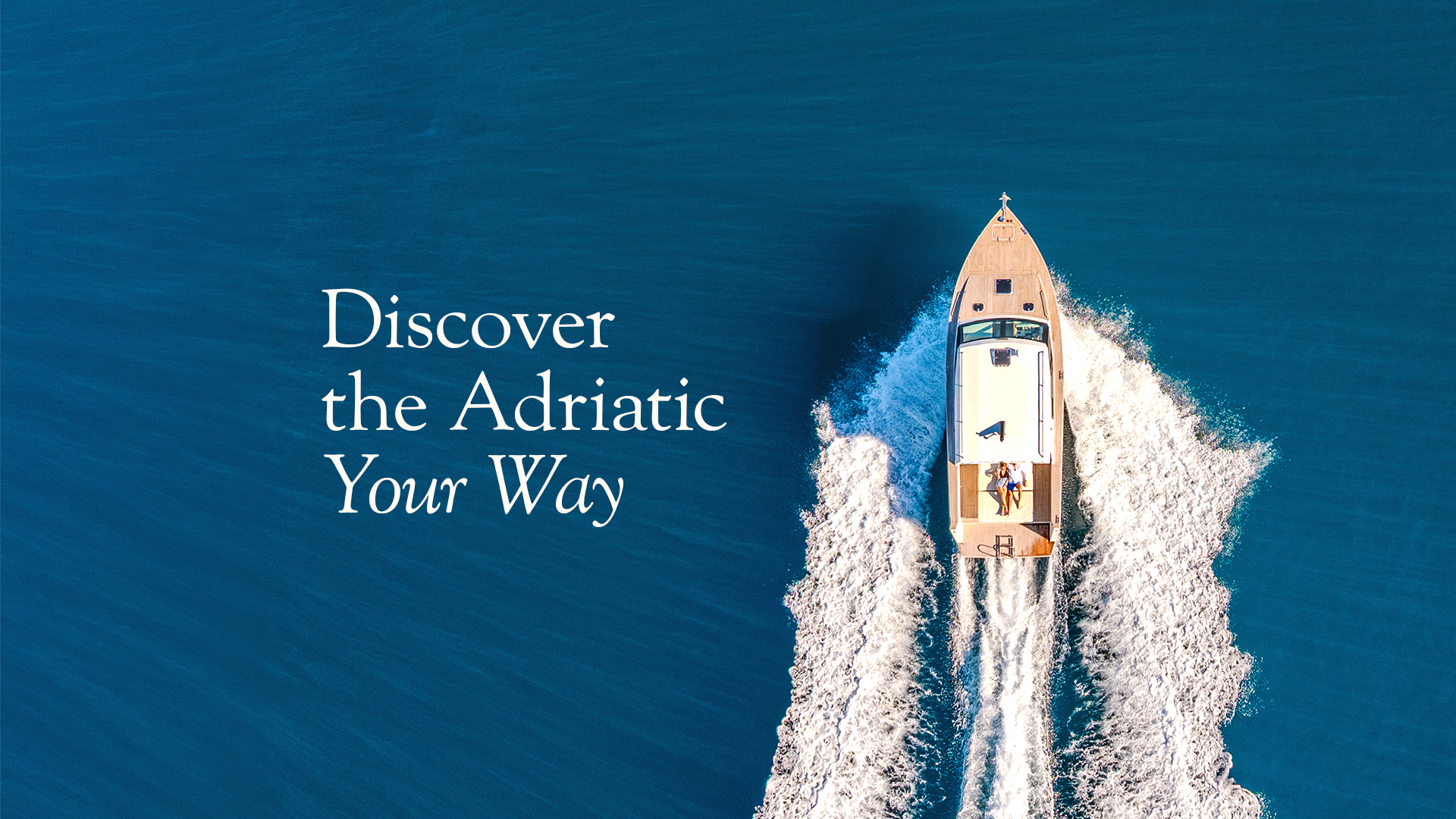
Estrales comes from maestral, the Adriatic wind associated with favorable sailing conditions. From maestral came Estral, and ultimately Estrales, giving the name a distinctive, more international and lyrical quality while keeping its origin connected to the sea.
From that starting point, the brand had its emotional core: the feeling of ideal conditions. Not luxury as excess, but luxury as ease. Everything in the right place. Nothing forced.
Standing Out in a Sea of Sameness
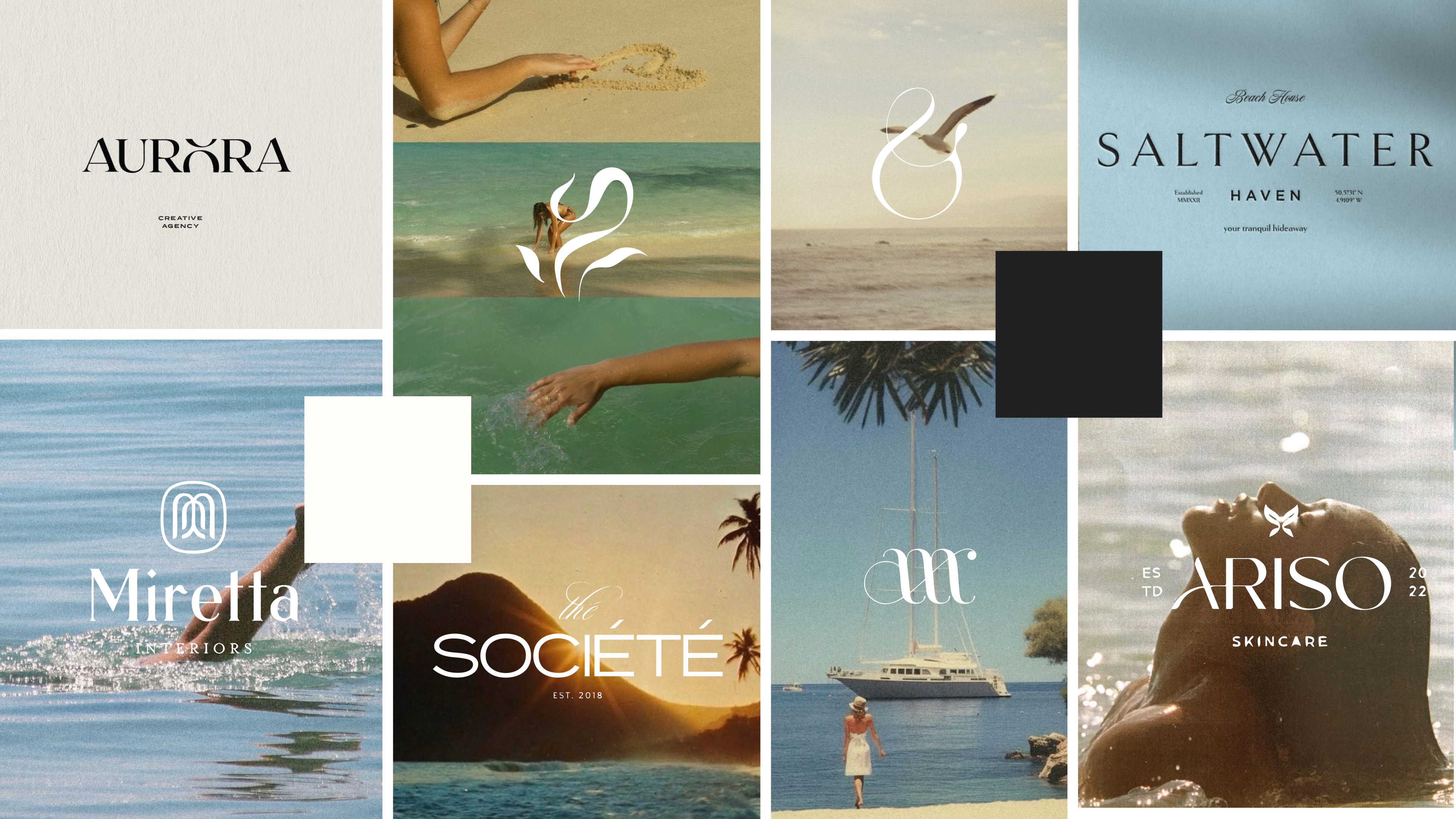
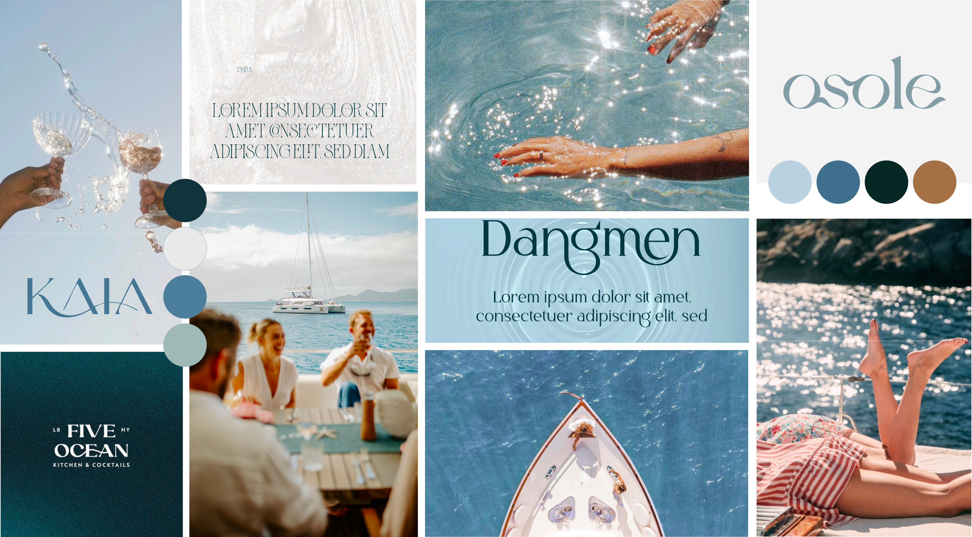
The nautical tourism market in Croatia is crowded with a familiar visual language: blue palettes, waves, boats and anchor symbols. Estrales needed a different approach, one that could feel premium without relying on the usual nautical clichés. The idea was simple: luxury that doesn’t shout.
With the naming and positioning in place, we developed a creative brief and explored two art directions, looking beyond the category towards boutique hospitality, lifestyle brands and editorial design. Together with the client, we reviewed both directions and explored several logo routes before refining the selected concept into the final visual identity.
A Wordmark Caught in the Wind
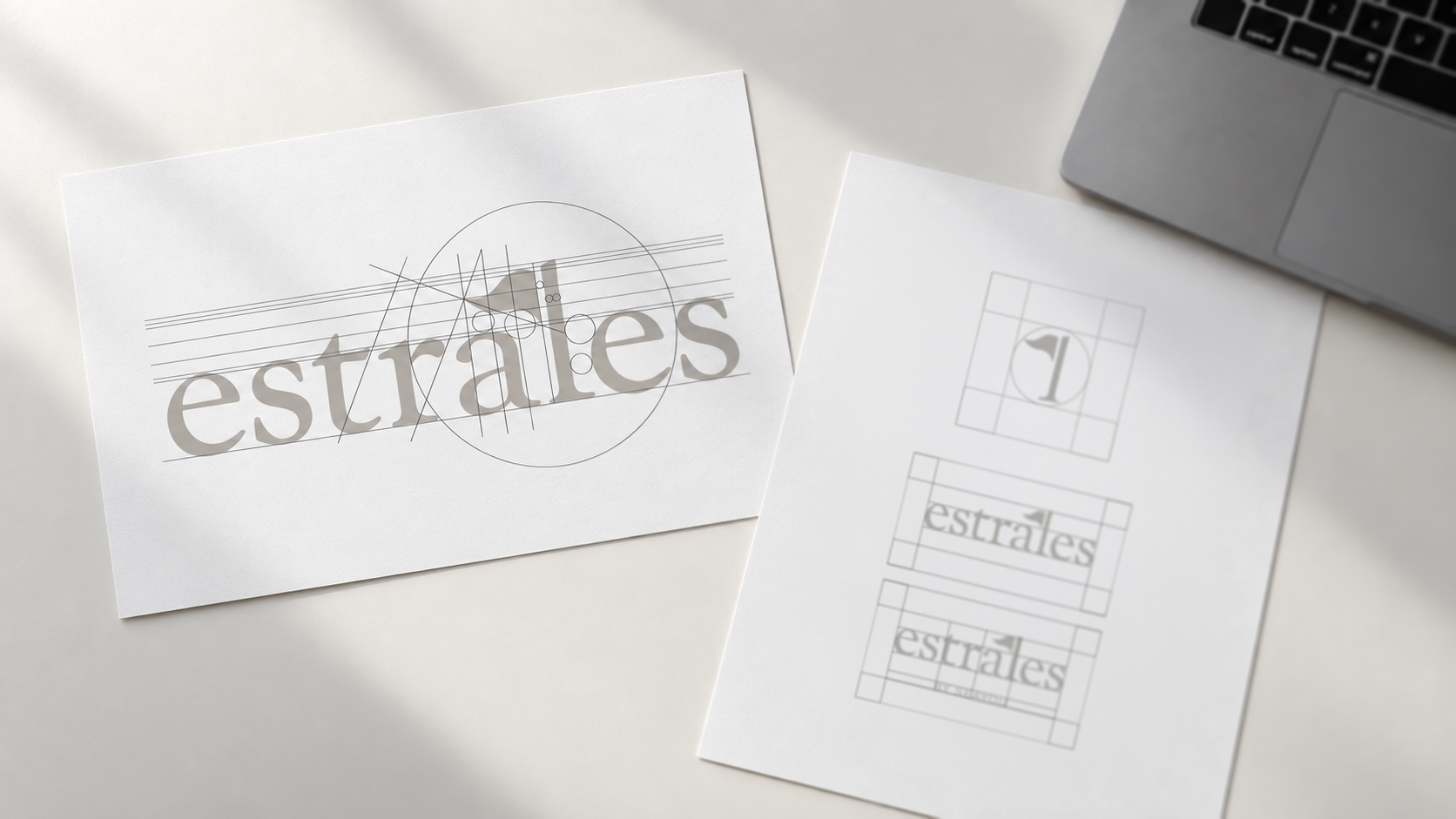
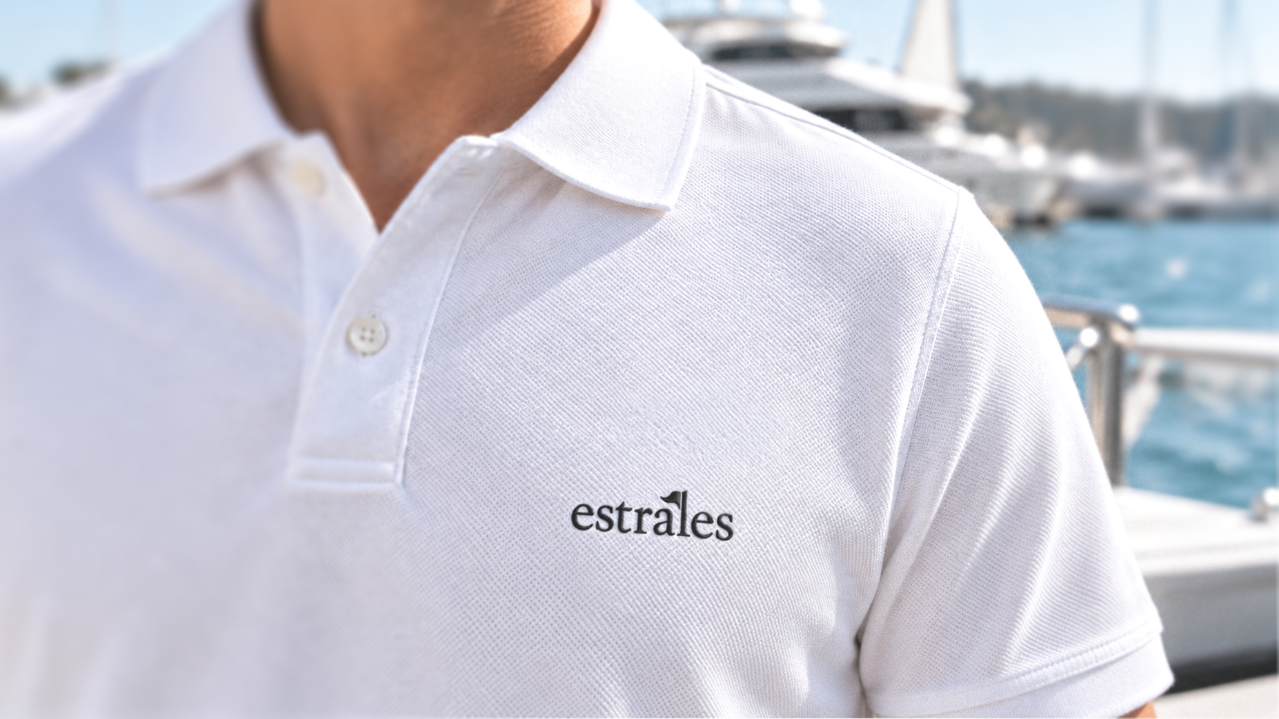
We built the Estrales logo as a serif wordmark, letting the name itself carry the identity.
Its defining detail appears in the letter “l”, where a small flag seems to catch the wind. The gesture connects the wordmark back to the maestral and the world of sailing without relying on an obvious nautical symbol.
We then isolated the detail as a standalone logomark, creating a compact brand signature suitable for favicons, profile images, and smaller applications. We also created a secondary version with “BY SEAYOU” for situations where the relationship with the parent brand needs to be communicated.
Quiet by Design
The visual system follows a simple principle: let clarity, balance, and detail do the work.
Instead of pure black and white, the primary palette uses a softer off-black and warm ivory, supported by graphite, deep Adriatic blues and subtle neutral tones. This creates contrast and depth while maintaining the calm, premium character established through the art direction.
Typography follows the same balance. A classic serif typeface brings warmth, elegance, and timelessness to headlines and key messages, while a clean contemporary sans-serif provides clarity and functionality across body copy, navigation, and digital communication.
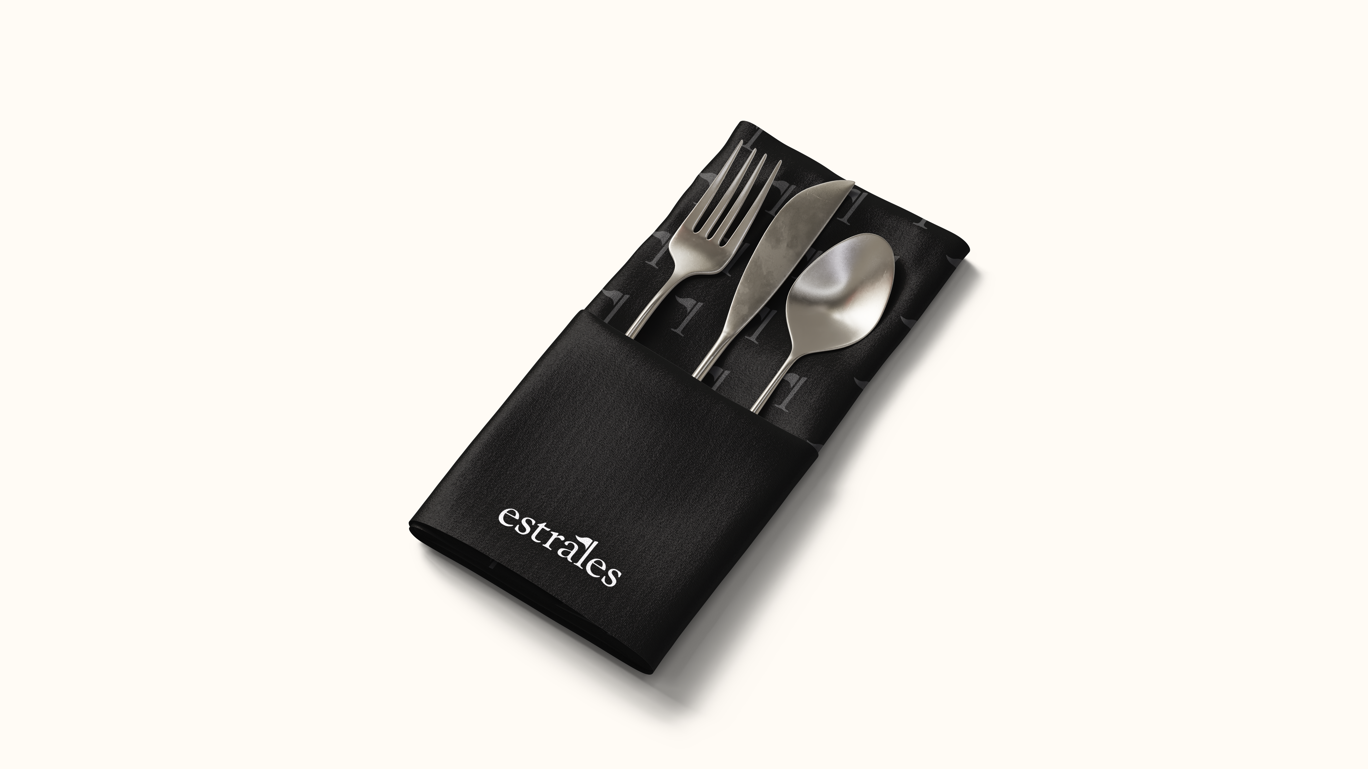
A simple graphic pattern derived from the flag element extends the identity beyond the logo while maintaining a clear connection to its original concept.
Together, these elements created a flexible visual language for brand communication and digital applications, without introducing unnecessary decoration.
A Brand Ready to Set Sail
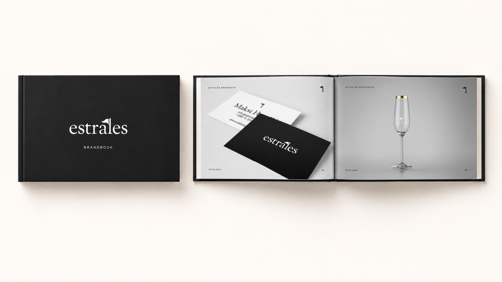
Once we defined the core identity, we documented the system in a brand book, including the logo system, color palette, typography, graphic pattern, usage rules, and key application examples.
With the branding phase completed, we handed the final assets over to our web development team, providing a clear visual foundation for the next stage of the brand’s digital presence. You can see the identity brought to life across the Estrales website.
The goal was never to design the most elaborate nautical brand. It was to design a brand that makes guests feel like they are in the right hands before they step onto a boat.
A name rooted in ideal conditions, a mark with a quiet detail worth finding, and an identity built to carry the brand with the same ease the name promises.
Looking to build a brand with a clear idea behind every detail?
Let’s create something worth remembering.
We are extremely pleased with both the collaboration and the entire process of building our brand. The team demonstrated strong expertise, creativity, and a clear understanding of our needs at every stage of the project, from naming and branding to website development.
What stood out most was their responsiveness, availability, and professional approach. They delivered everything on time, with clear communication, strong attention to detail, and consistently high-quality work.