A Visual Identity Inspired by Individuality and Connection
Talentstripe Branding case study
Brand Strategy
Visual Identity Design
Logo Design
Brand System Development
Art Direction
Digital Brand Applications
Brand Guidelines
A new kind of Recruitment
Talentstripe is a digital solution designed to deliver a flawless experience for both employers and job seekers. Their main priority is simplifying the process with a clear, intuitive, and trustworthy platform.
The recruitment industry is saturated with brands that look alike, use a generic visual language that feels outdated, and focus on employers. Talentstripe’s goal was to put the candidates at the center of their story, each with their own strengths. Our goal was to create a distinctive identity within a crowded market.
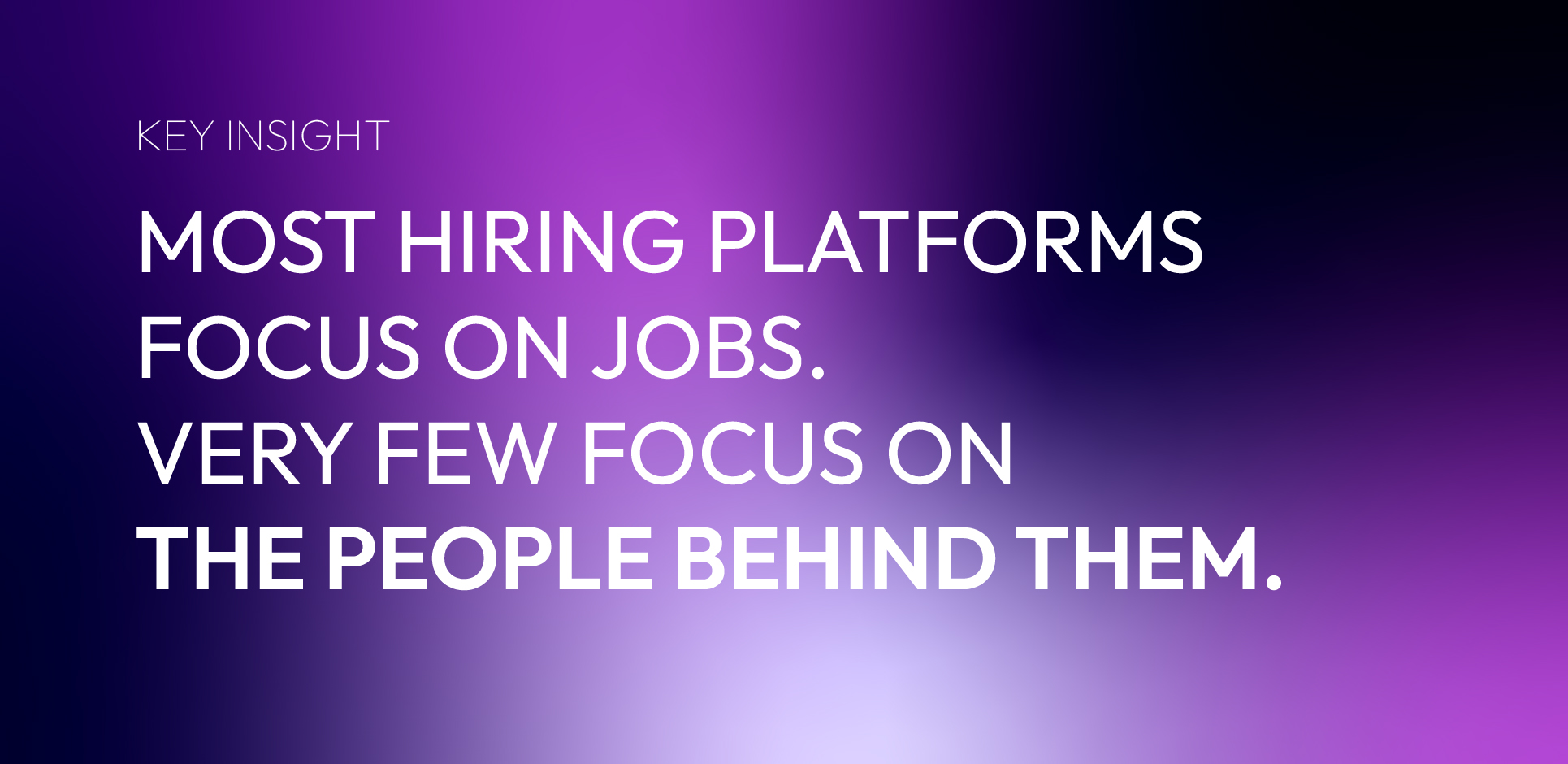
Through our research, two themes came out consistently: Individuality and synergy. Our key insight was that most hiring platforms focus on jobs. Very few focus on the people behind them.
Concepts
We decided to explore some visual metaphors for individuality and synergy. This conceptual exploration phase allowed us to experiment with different levels of abstraction while focusing on a single visual system.
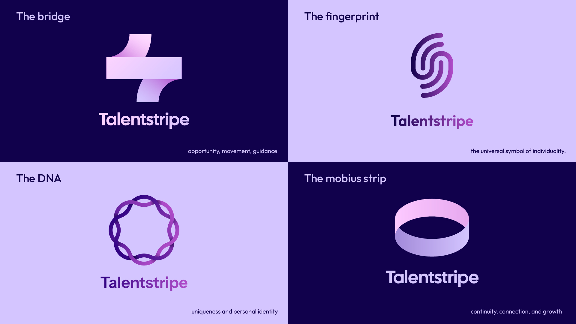
Final Direction
After exploring multiple directions, the fingerprint concept emerged as the strongest representation of Talentstripe’s core brand values. Even though each concept communicated the brand well, the fingerprint captured the balance between individuality and belonging that defines the platform.
As a universal symbol of identity, the fingerprint reinforces the idea that every candidate has a unique set of skills, experiences, and aspirations. The fingerprint, per se, is a highly intricate form, so to make it more visually appealing, we kept it as minimal as possible and made it symmetrical. As the fingerprint symbol is often associated with security or verification systems, we kept the form simple and created a modern and approachable symbol that feels uniquely human.
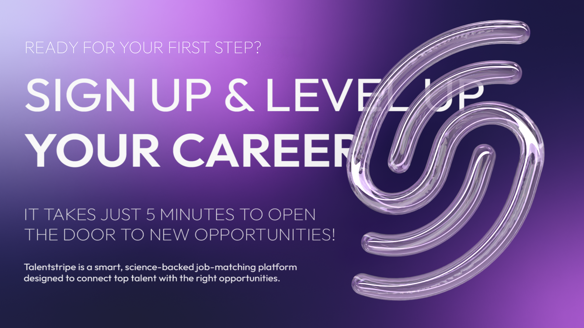
The resulting logomark is simple, memorable, and highly adaptable across digital touchpoints, making it equally effective as an app icon, interface element, or standalone brand asset. What we successfully achieved was putting the individual at the center of the story, reflecting Talentstripe’s commitment to creating connections between people and opportunities.
Designing a digital logo system
To achieve a logo system that is flexible and capable of performing across multiple digital platforms, we included:
- primary logo
- secondary logo
- logomark
- monochromatic version
- gradient version
- app icon
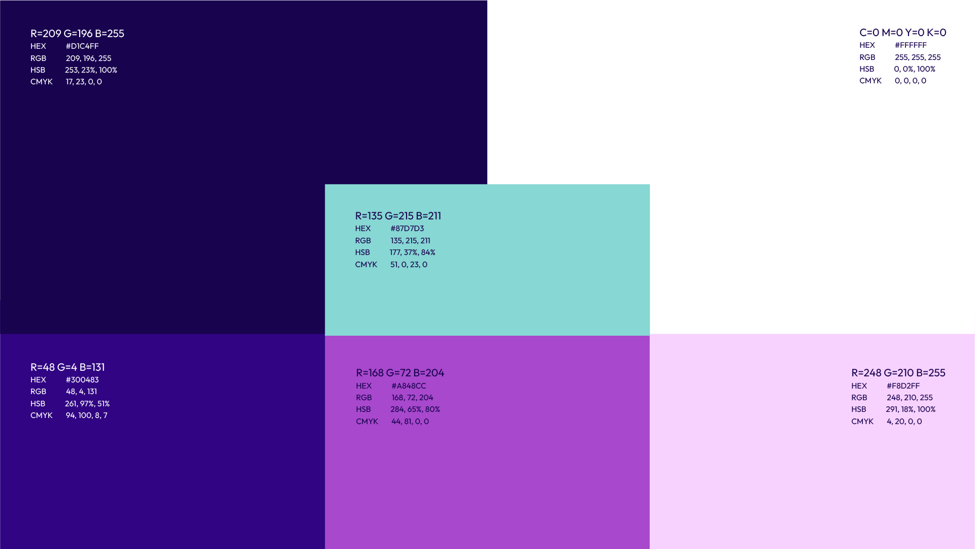
Color palette
We developed a color palette that relies heavily on tonal variations of a single color. While visually consistent, this approach limits contrast and hierarchy in digital interfaces. To improve usability and flexibility, we introduced a vibrant teal accent color.
Gradients matter (again)
For years, digital branding was dominated by flat design.
Today, many leading technology brands are reintroducing gradients to create more distinctive visual systems. Gradients add a human feel to what would otherwise be a sterile look.
Many big brands like Instagram and Apple have been shifting towards gradients in their visual systems for a while, while Google recently incorporated gradients for its workspace icons to add personality and differentiation.
For Talentstripe, gradients allowed us to communicate energy, movement, and a sense of modernity while maintaining simplicity at the core of the identity.
The Result
To ensure consistency as Talentstripe evolves, we developed a comprehensive set of brand guidelines.
Talentstripe is equipped with a visual identity that:
- Places candidates at the center of the story
- Differentiates itself within the recruitment industry
- Performs effectively across digital environments
- Supports future growth through a flexible brand system
The branding for Talentstripe was developed to solve a specific set of business challenges. From logo concepts to the color system and digital applications, we worked alongside the client to build a brand capable of growing with the product and creating a connection with its audience.
Following the completion of the branding, the Kontra web design and development division designed and built the website, ensuring a seamless translation of the identity into a fully functional digital experience.
Whether you’re launching a new product, repositioning an existing brand, or building a digital experience from the ground up, we help transform complex business challenges into clear, scalable design systems.